
A successful website combines great content with great design. While you might have the content on lock and a great product, web design is a whole other animal.
You have to consider the user experience, the color scheme, and of course, whether the site works well on the iPhone.
It’s a lot for the budding business owner to take in.
8 tips for building a better website
These aren’t necessarily the top web design trends for 2019. But, clear navigation, hi-res pics, and a winning color scheme never go out of style.
1. Take photos seriously

Visual assets are one of the key elements that make or break a website. But not everyone has access to a personal photographer or high-end equipment.
Original photos:
You might want to look into hiring someone for a few hours for some specific elements. There are some things that you need to produce yourself — or get a pro to do it for you.
Outsource, if possible:
- Headshots — if an “about me” section is needed
- Product shots — well, if you’re selling a product
- Process shots — anything related to services, or a look behind the scenes
That said, if it’s totally out of your budget, a recent smartphone and some choice editing apps can do the trick. VSCO, Lightroom, Snapseed—all great for editing Instagram pics — extends to your own site, too.
Stock photos are your best friend, especially if you have some photo editing capabilities. Fill in the blanks by adding stock shots that represent content.
Sites like Pexels, Unsplash, and Snappa are our top picks, as they allow you to simply “click to download” so you can get right to work.
But, tread carefully. We recommend avoiding stock shots with recognizable models. It’s a dead giveaway that you’re using stock photos.
One that comes to mind is that guy with the big beard and whimsical mustache—he seems to come up in all kinds of workplace content.


7 best websites to find copyright-free images
Read Now ►Beyond sourcing photos, everything should have a similar look and feel. A good way to get a sense of this is by looking at popular Instagram feeds.
You’ll notice they use the same filters and color schemes — which creates a cohesive feel. Doing this with your own photos and stock photos allows you to make all visual assets feel like they belong in the same collection.
Size should be uniform, too. So, if you’re posting blog content — all blogs should come with the same size photo header and formatting rules for embedded images and videos.
2. Navigation needs to be clear
Website navigation allows users to follow a map that gets them from one point to the next. As such, the fewer twists and turns, the better the user experience.
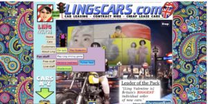
This example below is confusing. There’s no direct path from point A to B to Z.
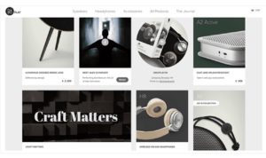
Alternatively, here’s a good example of clean, clear design. They’re not trying to get cute with the layout. Instead, visual interest lies in the products, not some crazy menu.
Navigation questions to ask yourself:
- Who is the target audience and what do you want them to accomplish while on the site?
- What kind of information or touchpoints are available on the website?
- How will I demonstrate what information is most important?
- How do I want people to get in touch?
A few extras to keep in mind:
- Dropdown menus should include essential information only
- Make logo part of the navigation – and make sure it’s clickable.
- Be sure contact details are listed on every page.
3. Design on a grid
You’re likely reading this because you aren’t some natural web design pro. That’s okay. Luckily today’s prevailing aesthetics are relatively clean and uncluttered—not much to do on your end.
A grid system allows you to plot out every photo, button, and text block so that all elements are aligned correctly.
The grid system has been around since the early days of print — and there are two types: landscape and portrait.
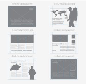
The main benefit is, you can easily make decisions about where to add images and content, as the grid inherently limits where you can place these elements.
4. Embrace the (white) space
White space is like a fresh drink of water when you’re taking on a big chunk of text.
Even the most avid readers prefer to scan their content, not take it in all at once. As a visual element, a wall of text isn’t pretty. It adds a visual texture that can create friction.
Don’t feel compelled to fill every square inch of site space. Let each element speak for itself, with enough space on each side for some visual breathing room.
Even websites can make people feel claustrophobic. Apply the same principles to your new site as you would your home — it’s not wall to wall stuff — it’s a few choice pieces here and there.
5. Coordinate your colors
When it comes to color, less is always more. A three-color palette on a white background is a good starting point. Think a neutral with a strong accent color to add some interest.
What those colors are is a whole other story. Failing to add color means you’re going to be looking at a website with minimal interest. Too much color and you risk making a poor impression. Web visitors won’t want to enter the fun house.
Hubspot put together this handy guide for those who want to dive a little deeper into color theory and how it relates to the web.
Finally, you’ll want to make sure that you keep the same color scheme throughout the site. Consistency builds trust, and color is one of the easiest ways to keep the same look going across pages and onto other platforms.
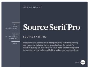
6. Limit fonts
The more fonts added to the mix, the messier your site will look. The rule of thumb here is to use no more than three fonts.
Use one for headers, one for body content, and one accent font. An accent font should be used sparingly — generally, you’d see this in branded graphics, a logo, and other pieces of marketing collateral.
If you’re new to the world of typeface, Google Design is a really solid resource. They’ve put together a beginner’s guide to picking the right web fonts.
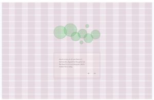
Prefer something more visual? Canva offers a different approach with several examples, like this one:
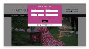
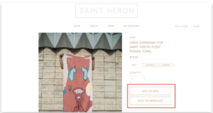
7. Understand the art of the CTA
Just about any site, regardless of the goal, must have what’s called a call to action, or CTA. CTAs are generally represented by buttons or links placed on the page. The goal is to get the reader to take action.
That action depends on what you’re trying to do, though. It’s not all “buy, buy, buy.”
For example, if you are creating a blog, your primary CTAs are likely things like “subscribe now” “enter email for free ebook” and so on. You’re promising something in return for providing an email and a name.
An e-commerce store might have a link to buy products or a newsletter sign-up.
Ground rules for driving action:
- Action words
- No wishy-washy language
- Tell users exactly what you want them to do
- One CTA per page
- Must be relevant to the content on the page
- Must also align with goals
- Make sure your site is responsive
This last tip isn’t so much something you need to do. Rather, it’s something that you need to make sure is part of the web hosting package you sign up for.
Wix, Squarespace, and others are automatically mobile responsive. So whatever you create for the web is automatically optimized for mobile. Most platforms allow you to preview both versions before you publish.
Wrapping up
Hopefully, the information above allows you to feel less overwhelmed by the whole idea of creating a website.
While it might seem like a lot, the main theme across the board is: you need to keep things neat. Photos should be crisp and clear, fonts and colors consistent, all elements aligned on the grid.
Beyond that, you’ll start to develop your own style as you go. Don’t be afraid to keep things simple — the whole purpose of the site is to make things easy for users.